Relax Relaunch
Evolving An Existing Brand While Keeping What Works
The Starting Point
When TRA first reached out, they weren’t looking for a reinvention. They already had what many brands spend years building: a strong identity, consistent product lines, and one of the most detailed style guides we’ve ever received from a new client. What they needed wasn’t a full reset, but they felt they needed an update. Something that could take the foundation they’d built and level it up to meet the energy of today’s market.
Before the Refresh
The client provided their original label designs as a starting point for the new direction.
The Challenge
Updating packaging for an established brand is a balancing act. Push too far, and you risk alienating loyal customers. Play it too safe, and the rebrand gets lost in the noise.
For TRA, the foundation was strong, but the client felt the designs were too flat, too safe, too quiet. They wanted something more bold and current, while still honoring the styles their customers already knew and loved.
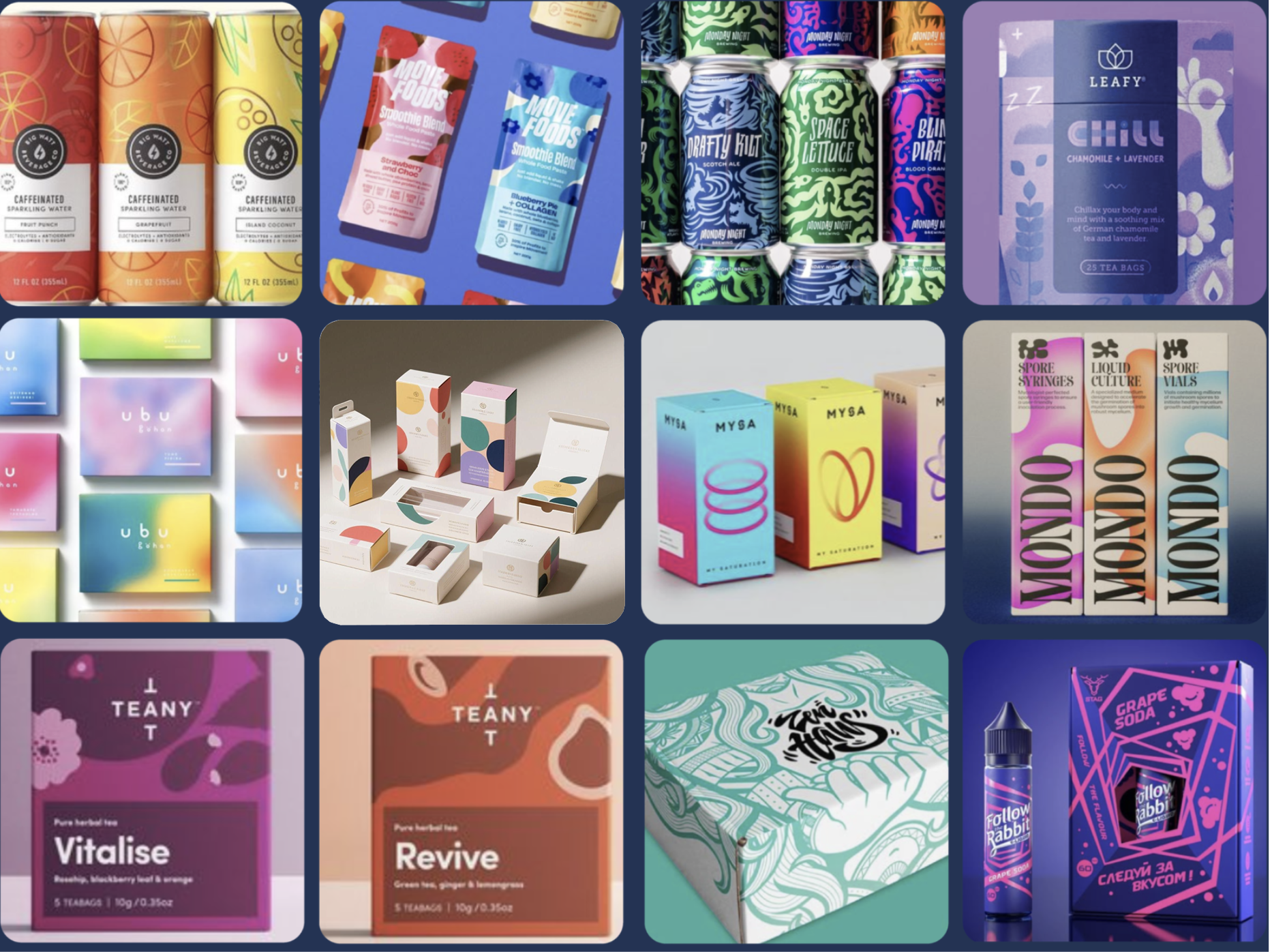
Creative Exploration
Our first step was moodboarding, pulling packaging references from across the market to spark conversation around direction, tone, and intent.
The client gravitated toward a few key styles: layered gradients, soft lighting, and crisp iconography. Those became our creative anchor moving forward.
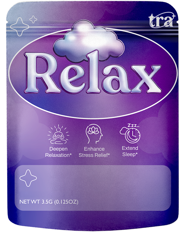
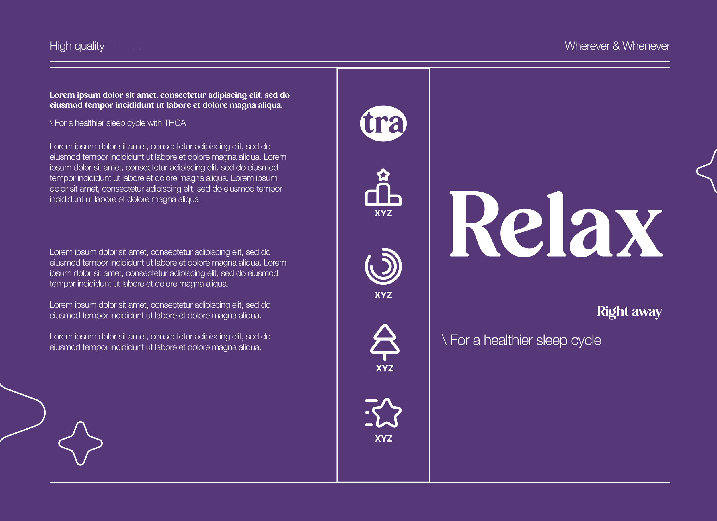
The First Product
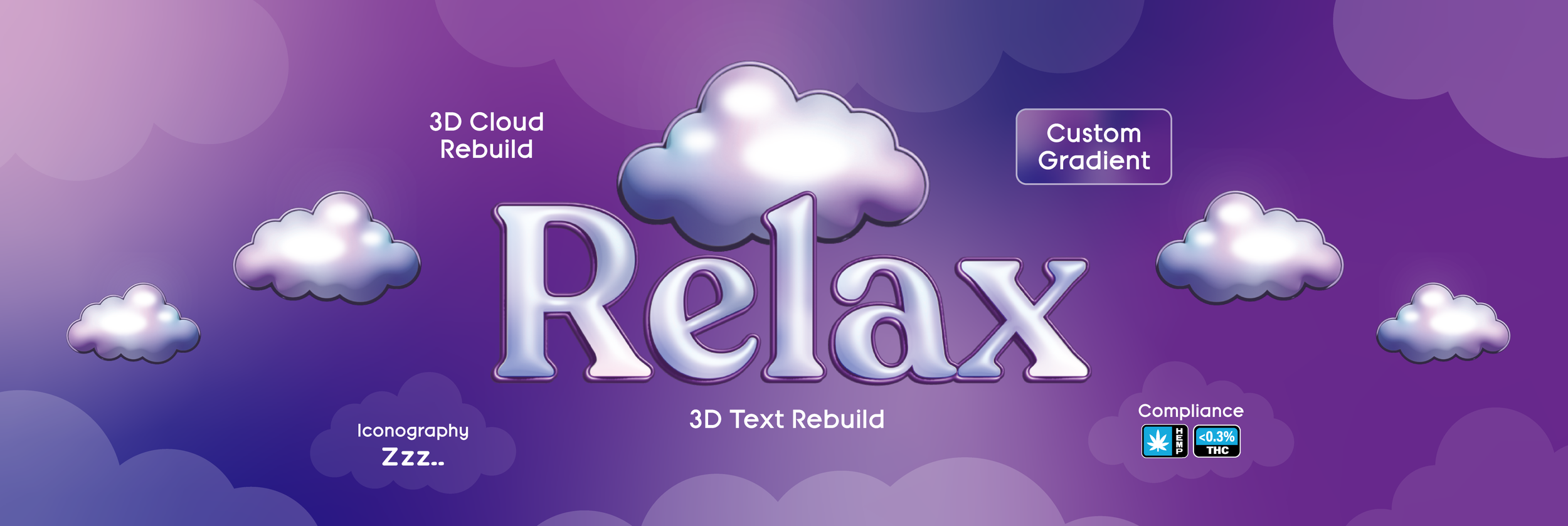
With a clear direction in place, we started with the first product: Relax. We kept the trusted color scheme and product name while elevating the look with more depth and dimension.
We rebuilt the name in 3D, casting it in soft lighting and metallic highlights that gave it depth and presence. The original cloud icon was reimagined and extruded into the same space with matching light treatment, tying old to new in a way that felt seamless. An oval frame added structure, while faint, balanced icons created a subtle visual flow.
To finish, we placed all required compliance text, symbols, and warning.
Relax became the blueprint for the entire series, a balance of trust and freshness that could scale across every future product.
Pro Tip: Build a brand, not just a design.
A look inside our design process for the Relax Relaunch packaging using Adobe Illustrator's 3D tools and subtle gradient work. We enhanced the existing artwork with depth and dimension, creating a modern elevated look while keeping the brand's original identity intact and production ready.
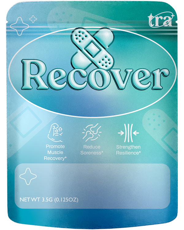
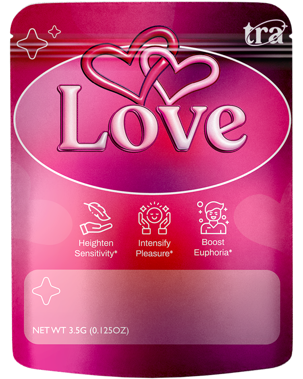
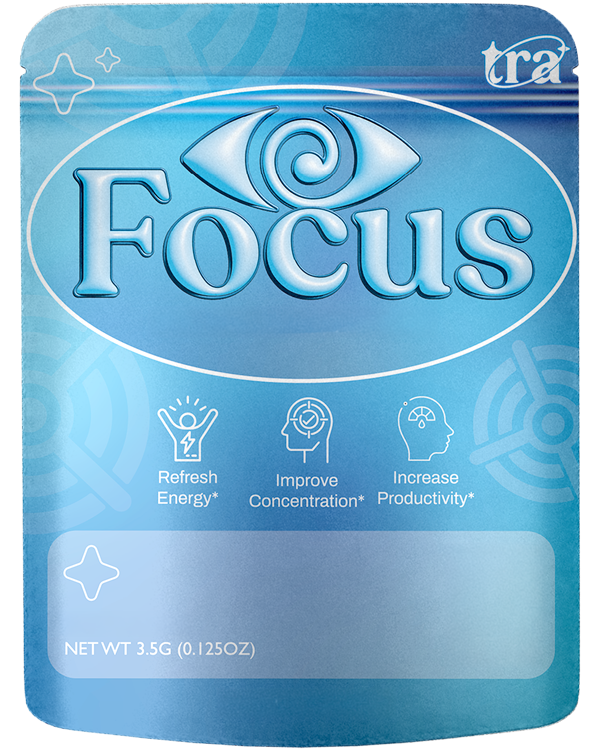
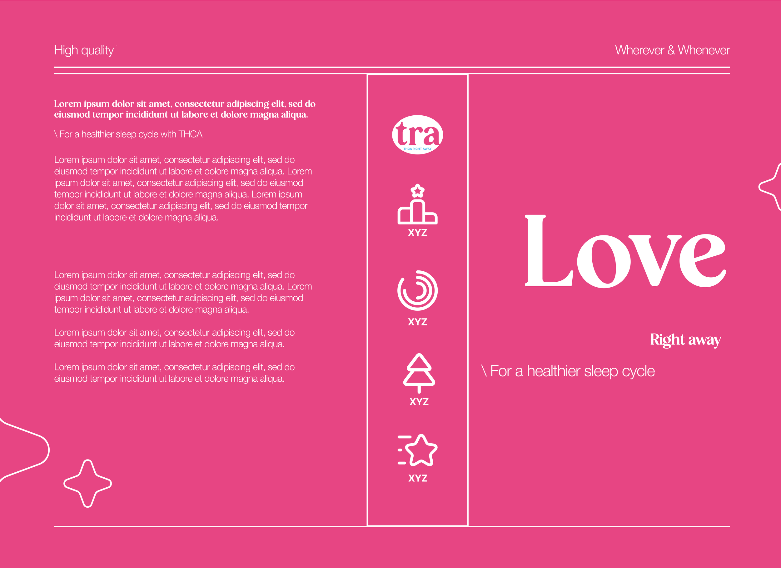
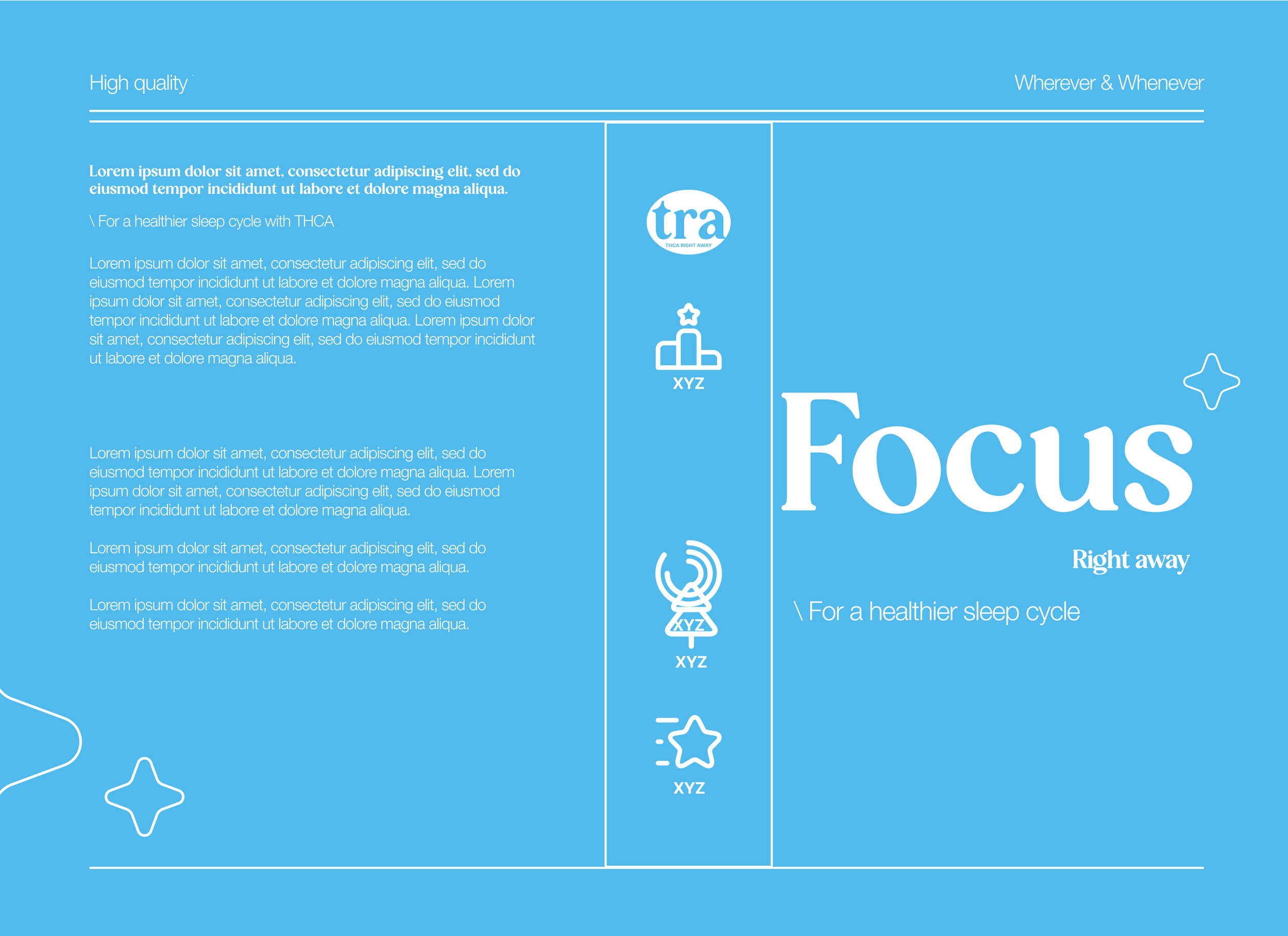
Scaling the System
What began as a packaging refresh became a system the brand could lean on for every launch. Each product carried its own identity while reinforcing the larger brand, creating consistency customers could trust and recognition that builds over time.
This is where design moves beyond decoration. It becomes a tool for growth.