
stamped in sf
The story of a bold illustrative logo crafted in the Bay Area.
Made In The Bay
A Bay Arean walked into our Burlingame studio with a clear vision. He needed a raw, illustrated logo, hand-drawn, and rooted in local culture.
We got right to work, crafting a graphic identity that blends street energy, Bay Area West Coast flavor, and a stamped-in-place attitude, built to stand out in a crowded market.
Graphics rooted in the culture
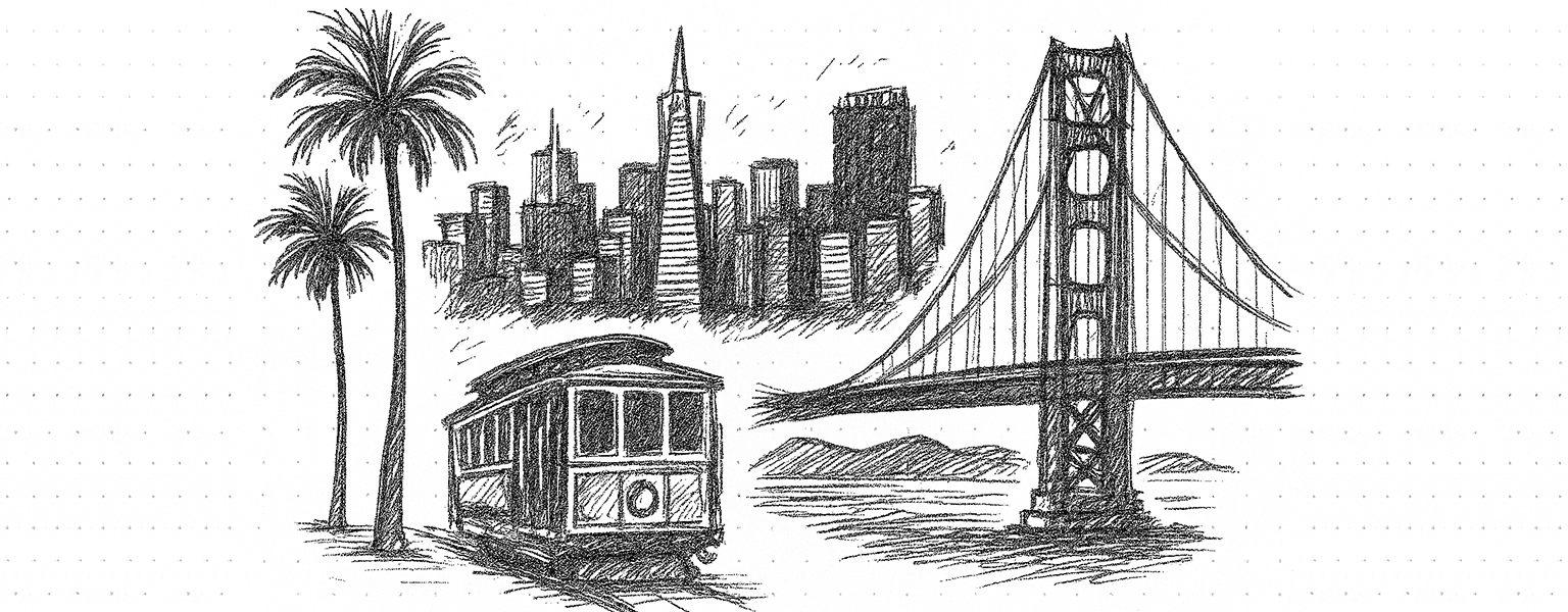
Before putting pencil to paper, we identified the symbols that visually define the San Francisco Bay Area: the Golden Gate Bridge, classic cable cars, towering palm trees, rolling ocean waves, and cloudy skies.
With those symbols in place, we sketched layouts to see how they could play together in one frame. Balancing scale and perspective made the bridge feel monumental, the cable car pop in the foreground, and every element work in harmony.
The result was straight up Stamped. A hand-illustrated logo blending these icons into one bold, cohesive scene — capturing Bay Area pride in a way that’s as layered and vibrant as the city itself.

Stamp It, Stick It
The final step was making the logo tangible. We transformed Stamped’s hand-drawn mark into custom multilayer holographic die-cut stickers built with depth, shine, and edge. The logo itself became a collectible, a promo piece, and a brand extender, pushing the identity far beyond the screen.
This is where design becomes more than art. It becomes culture. A logo that started on paper now lives in the streets, in conversations, and in the hands of the community.
Pro Tip: Gloss labels POP!
Spot gloss grabs attention and makes products sell faster.
A real life look at the Stamped in SF logo printed as a silver holographic die cut sticker. This video highlights how a hand drawn illustrative design transforms into a physical product, capturing texture, reflectivity, and the impact of premium materials.