The Loudest
Clean, cohesive, and louder than ever from a bold new logo to matching bag designs.
How It Started
Every once in a while a brand has a moment when the logo that once felt like the perfect fit no longer reflects who they are. That was the case for Loudest in the City. Their bold, blocky look had served them well, but it was time to evolve. Keeping the energy that made them stand out while refining it into something sharper, cleaner, and more modern. We struck a balance between honoring their roots while aligning the identity with who they’d become.
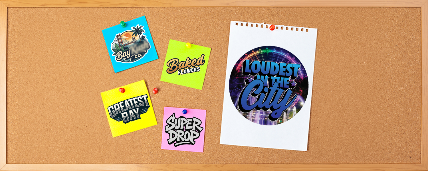
Before the Revamp
The client provided their original logo and existing visuals to help guide the new direction.
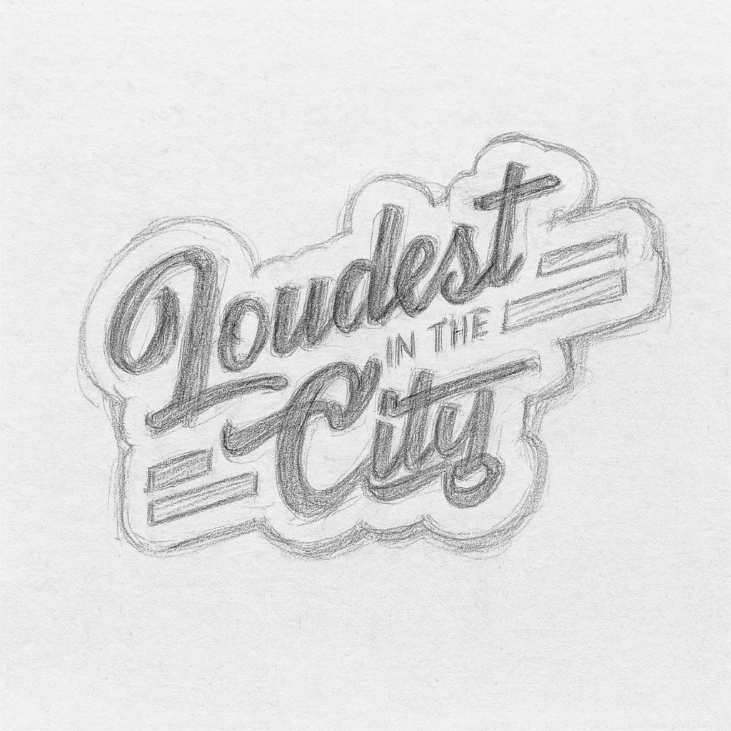
The Loudest Mark
With the vision set, the next step was building the of the logo itself. A wordmark doesn’t hide behind icons. Every curve and line has to carry weight. For Loudest in the City, we refined each letter to feel balanced, and unmistakably theirs. With the structure in place, it was time to bring it to life through color.
The Palette Process
With the structure in place, the next challenge was color. For a brand called Loudest in the City, the palette had to live up to the name.
We started with deep purples and electric blues, drawing from the energy of a city night. From there, we pushed into bolder contrasts, testing shifts like blue and orange, until we found a direction that felt unapologetically loud yet instantly readable. The results were colors that carried energy without losing clarity, built to perform across every touchpoint from packaging to digital.
Pro Tip: Play with Color
The right palette isn’t about picking your favorite shades, it’s about finding the ones that speak for your brand. Exploring multiple directions helps reveal the combination that makes your brand recognizable in a glance and unforgettable long after.
This behind the scenes video highlights the refinement process of the Loudest in the City logo. Working in Adobe Illustrator, we customize vector points, adjust curves, and apply gradients to shape a bold, balanced wordmark.

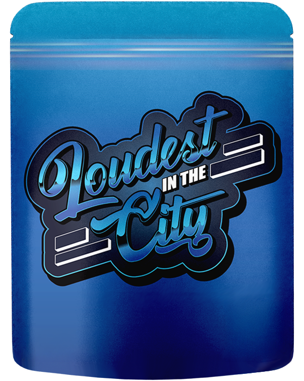
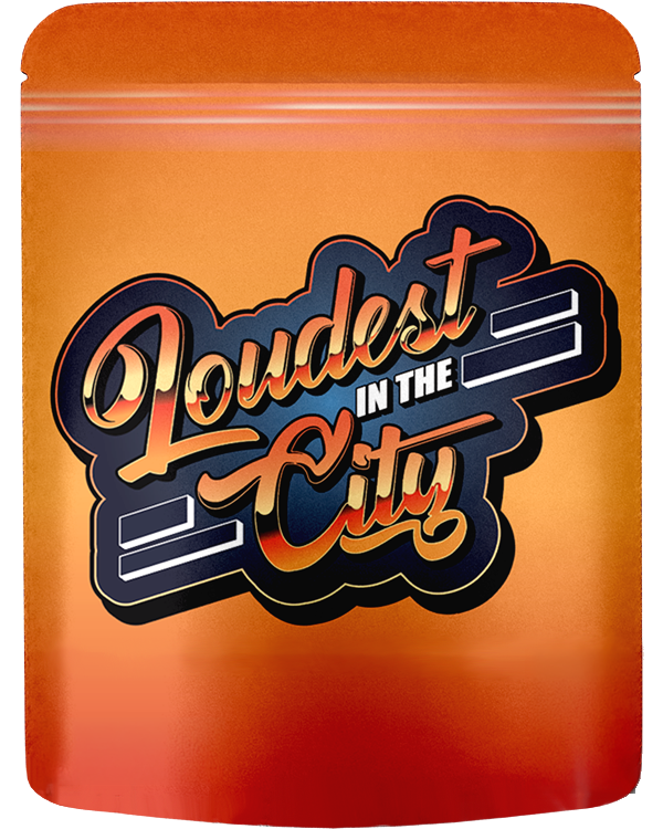
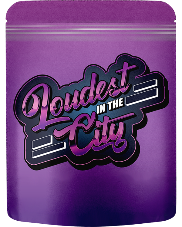
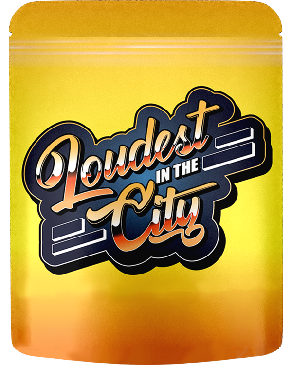
From Logo to Lineup
A strong logo is just the beginning. For Loudest in the City, it became the spark for a full visual system. One that carried their identity across packaging that feels cohesive, scalable, and unmistakably theirs.
Each bag introduced a strain-specific background color, while the bold, blocky wordmark stayed front and center. That balance made the collection feel like a family, unified at a glance, yet with enough personality for every variant to stand on its own.